Woke Warriors Redesigned
These last few days, I have been provoked to to quite serious melancholy and helpless anger to see what may well be the last days on earth of the comic giant Marvel, source of much youthful joy during many idle hours.
I have also been provoked to quite frivolous nerd rage by the sheer, appalling, if not perfect badness of the designs for the latest team of ‘woke’ teen heroes, and spent an undue amount of time suggesting a write up of the first issue, Fat Chance and Her Amazing Friends versus Stilt-Man as well as answering the challenge of how one might salvage this dumpster fire with a redesign of the same basic concept, only done in a workmanlike fashion.
Anything merely competent would be superior by far to the self-parody joke garbage Vecchio and Kibblesmith eructated out of their own inner spiritual darkness.
But your humble author is not the only comic fan looking at the stupidest idea in comic book history and thinking better can be done with it.
Here are some of the illustrations I found during a random search.
Some are better than others. All are better than Mr. Vecchio’s attempt. I offer this as Exhibit A to support that theory that the childish art, ugly colors, and so on is quite deliberate.
First, the old:
Horrible on every level.
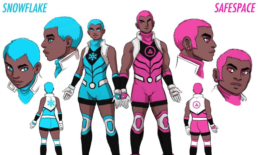
Horrible design, horribly executed, cardboard characters selected by Diversity checklist:

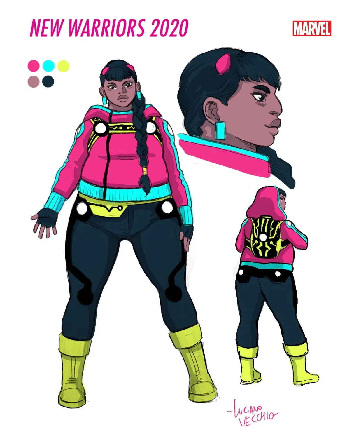
New:
Here is the same basic design, color corrected, and drawn with more skill of draftsmanship.

Some show better understanding of how to draw the human figure, or the heroic figure.

Some are more idealized than others:

Others are competently done, but retain some of the unfortunate elements:

Others are more original, even eccentric:


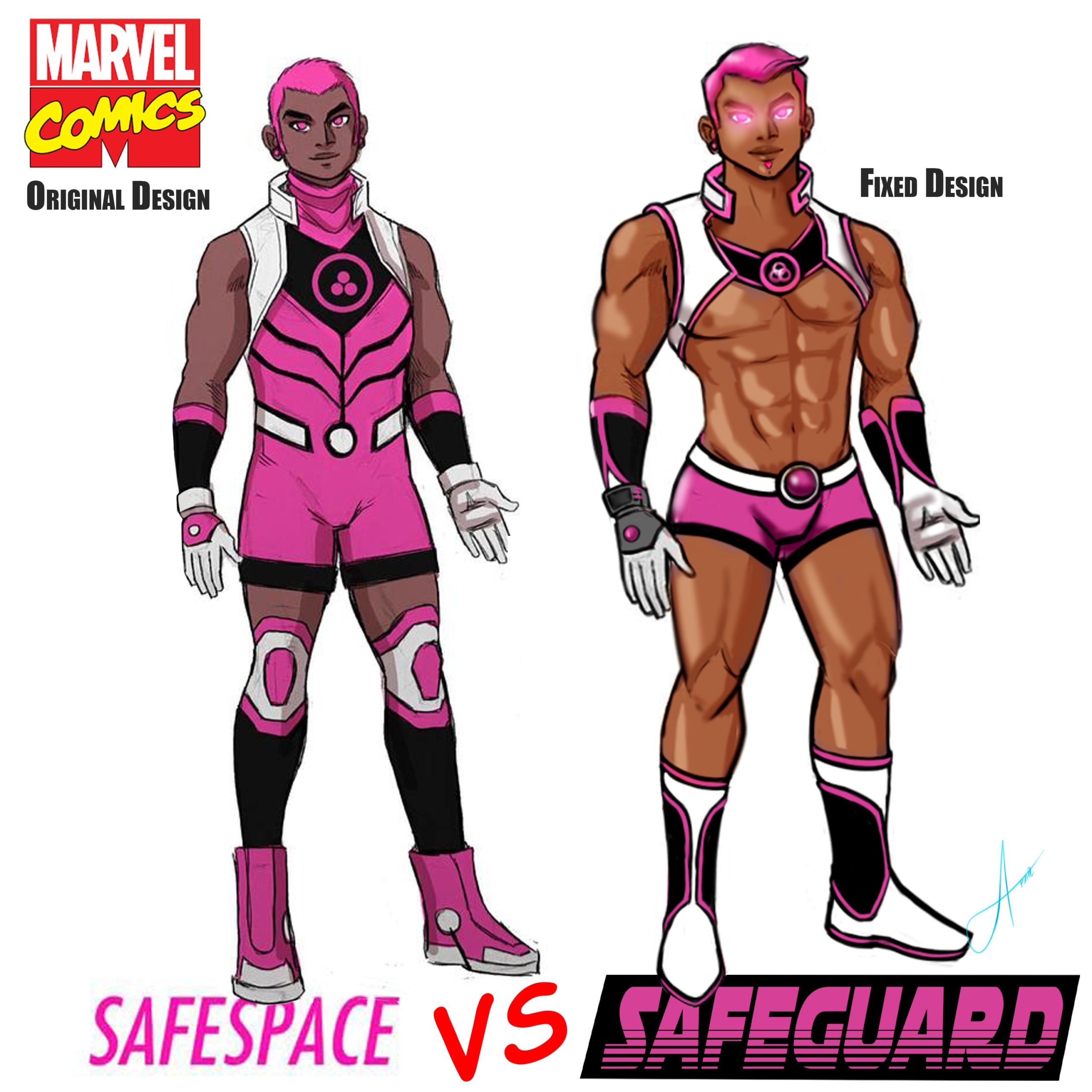
But even an amateur drawing corrected the main and most disquieting flaw with these designs, which was their unsightly unisex dysphoria. The boy was male, the girl was female, as Darwin and Darwin’s creator, intended.

Some look very professional, others less so:


Some also redesigned the powers to give them more sense:


Nearly all want to see the self-parody names changed

I found one redesign of Screentime. You can see how simple it is to give a toon personality.

Finally, someone redesigned the Goth kid B Negative.

Forgive me if I cannot recite their names of the illustrators above, aside from Kajimateria: all of them should be immortalized while the names of Kibblesmith the Child Pervertarian (yes, he pushes sodomy on children — see Santa’s Husband for details) and Vecchio the Vile, Defiler of the Human Eye, both should enjoy the fate as Herostratus the Arsonist deserved but escaped: being forgotten forever.
About John C Wright
John C. Wright is a practicing philosopher, a retired attorney, newspaperman, and newspaper editor, and a published author of science fiction. Once a Houyhnhnm, he was expelled from the august ranks of purely rational beings when he fell in love; but retains an honorary title.